I think it was about a year ago when I started seriously thinking about my hydration habits and how much water I should be drinking versus how much I was actually drinking every day. Now, there’s no shortage of apps which allow you to not only track your water consumption, but can also remind you to drink something in regular intervals and even creating a stronger habit through gamification—but I just couldn’t find the right one for me.
Questioning the Status Quo
Initially, I did a bit of research, tried two of these apps and even stuck with the second one for around half a year. It definitely helped me drink more water—but I was never quite happy with it. Adding and editing entries that deviated from the default amount set while setting up the app was cumbersome, the UI felt clunky and the data wasn’t presented very well. On top of that, while the data about my drinking habits itself (hopefully) was kept private, the app kept showing annoying ads and possibly included a bunch of trackers.
So me being myself, I immediately had the urge to create my own application that better suited my needs. That’s how Hydrt was born—which after far too long is finally available for you to install and use.

Hydration Tracking with Hydrt
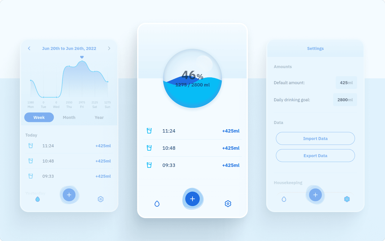
Hydrt does one thing: it allows you to enter how much water you’ve consumed right after you’ve done so and uses that data to track your progress toward your very own drinking goal and show you useful historical information so you can form and improve a healthy habit.
The idea is simple, many of us have a standard-sized glass or water bottle which we predominately use throughout the day. So whenever that container is empty, you take out your phone, tap the app, tap the plus and the water is added to your total for the day. Tap, tap, done.
Once you’ve done so a couple of times, it’ll become second nature and even better: seeing the app icon on your phone will hopefully also remind you that you probably should still finished that half full glass on your table, or the almost empty bottle in your backpack. You know, just so you can be done with it.
But even when you’re at a restaurant or a friend’s place, adding liquid should be easy. That’s why you can also hold the add button and slide it left or right to add a custom amount—something that was very important to me personally, since the less friction there is, the easier it is to build a healthy habit.
Data, but Private
Your preferences, such as your personal drinking goal and how much water fits in your standard container, but also all the data about how much you drank when stays right on your device. It isn’t shared with anyone and if you ever want to switch devices, you can easily export it from the settings.

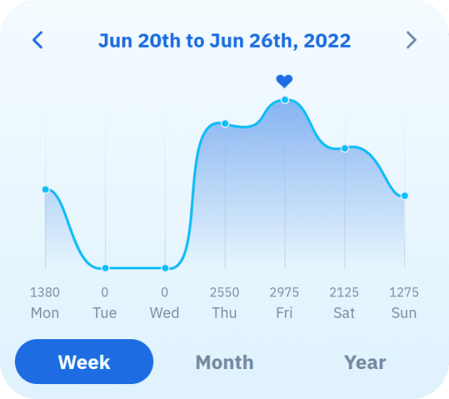
Personally, I find some light statistics very interesting. They allow me to track my progress when trying to reach a particular goal, but also show days and times when I didn’t drink enough, for example, and allow me to reflect on what happend or what was different. That’s why I took some extra care to display the data the app collects in a clear and engaging way. The way the diagrams resemble a wave of water is just a happy side-effect. 😉
If you’re curious to see for yourself, just try it out, it’s free—or you can read on for some more technical details and things I wanted to focus on while designing and building this app.
Motion Considerations and Technical Details
Hydrt is also the first app I’ve built using the new recommended way of building Vue apps with Vite and the Composition API. It was…a journey. I can see that the Composition API has some benefits – but I’m glad the Options API will stick around, even though I kind of feel coerced into using it. Vite is very fast and that paired with a new deployment process onto an Uberspace actually leads to a new version being available in under two minutes after a release.
I also enjoyed learning about other great new features in the libraries I use, such as the live queries in Dexie.js—the library I use for storing user data locally in Indexed DB. These live queries work across tabs and allow for database queries to be reactive, i.e. I do not manually need to insert a newly created item into the view of my app, the live query automatically re-runs and returns the updated data after another part of the application updated the database. That’s the kind of magic I love and it basically made using a state-management library for Hydrt redundant (although not quite, since some data doesn’t need to be persisted and using Pinia for that was the better choice).
On the visual side, I also wanted to up my animation game. So I put some extra care and effort into the transitions between the different states of the onboarding experience, as well as in little touches all throughout the app. I was very happy to hear one of my first testers describe the animations as giving the app a “very soft feeling—like water”. Motion is such an integral part of UI design, but it is also tricky, because it can easily be overdone and thus turn overwhelming. Subtle tweaks to easing curves alone can have a huge impact on the perceived speed of an application!
I surely still have a lot to learn in that regard, but I’m happy how Hydrt turned out, all in all and I’ve been actively using it for about two weeks now.
Next Steps
Software is never truly done though and while Hydrt is a really simple app and I consider it feature complete, there are still some tweaks I’d like to maybe get to if I have time for them.
Right now, the app is very light keeping in line with the themes of water, friendliness and health, but I do realise that many people use their devices in dark mode to save battery or just to not blind themselves every time they look at their phone in a dark environment. That’s why adding support for prefers-color-scheme: dark is something I’m definitely considering.
And last, but not least, while Hydrt is meant to be used on the device you most likely always have on you or close by (i.e. your phone), it being a cross-platform PWA means that there’s the possibility that some users may want to try or even use it on devices with larger screens. Since the app is responsive, this does technically work already, but I feel like the experience could be improved by following some UI patters users expect on desktop-like experiences.
A Word on Notifications
Some early adopters have mentioned the wish for proactive notifications reminding them to drink something in regular intervals. Although I personally wouldn’t find such a feature useful, I did initially plan on implementing it using the Notification Triggers API that was still in development at the time I was conceptualising the app.
Unfortunately, the API is no longer being pursued, which means the only way to add such notifications would be through actual push notifications sent by a server—something I think is totally overkill for an app like this. So unless an alternative to the Notification Triggers API comes around, Hydrt won’t be able to proactively remind you to drink something, sorry. 😅
Try it Today!
If you’re still here after all the technical details and that bit of bad news, maybe now is the perfect time to give Hydrt a try—and check out my other apps while you’re at it. 😉
As usual, thank you very much for stopping by and reading this article. If you have any thoughts, opinions, or questions about Hydrt, feel free to reach out via Mastodon or Twitter. Have a great day!