Icons are arguably part of nearly every front-end project these days, be it a website or an app. Along with the choice of colour, images and typography, they form one of the base pillars of a project’s visual identity—and while there are many great icon libraries out there, they don’t always match all requirements. Besides, a fully custom icon set created specifically for a project adds yet another touch of polish and professionalism.
Since most icons are simple and don’t require complex textures, SVG is an ideal format for them because those vector files are infinitely scaleable, native to the web and small.
Unfortunately, creating icons in itself is already time-consuming, and implementing them into a framework such as Vue can quickly become a chore once the amount of icons grows. There are a couple of ways this integration can happen:
- Using the SVG directly as an image tag
- Creating a component for every icon, which uses the SVG code as its template
- Creating a single icon component which dynamically sets the right SVG data based on a prop
- Turning the SVGs into an icon font
- Using an SVG sprite
All of these options have advantages and drawbacks, varying degrees of flexibility and feasibility. In my recent projects, I’ve always settled on the last, using an automatically generated SVG sprite, basically a single SVG file that contains all icons and then making use of the <use> element to pick and chose which icon to use where in my project.
Credit Where Credit is Due
I didn’t invent this technique, it is based on this article by Kevin Lee Drum on CSS Tricks: A Font-Like SVG Icon System for Vue, but much has changed in the front-end world since it was published and some of the libraries and its reliability on Webpack no longer fit my requirements. In this post, I want to instead present my current method for integrating custom icons in a modern Vite + Vue stack.
Side Note: while I’m using Vue, you should be able to easily adapt this technique to your framework of choice, since the core principle of generating an SVG sprite doesn’t rely on any Vue-specific techniques.
What We’re Going to Build
I’m going to show you how to write a custom Vite plugin and a set of two Vue components that automatically generate an SVG sprite optimised with SVGO from a folder within your project and allow you to use these icons anywhere else in your project.
This technique is ideal for medium to large projects which have a lot of icons that may change frequently and are used in different contexts, since it allows a high degree of flexibility, such as recolouring the icons from CSS and updating or adding new icons by simply dropping a new file into a folder.
However, be aware that the SVG sprite containing all icons will be included on every page, even if the page itself may only use a few of the icons. If your project is a multi-page-app or website which only uses a few icons on every page, but has a large amount of different icons, another technique may be better suited for your requirements.
Prerequisites
If you’d like to follow along, you’ll need the following environment:
- A simple Vue-application scaffolded with Vite 4 (
npm create vue@latest) - A folder full of SVG icons within that project, e.g.
/src/assets/icons/ - Your code-editor of choice
The Vite Plugin
The core of this technique is the Vite Plugin that is responsible for loading the SVGs in the icon folder and optimising them with SVGO, so make sure to add SVGO as a dev dependency to your project: npm i -D svgo.
Next, create a vite-plugins directory at the root of your project and add a file called svgo.js to it. This is where the source code of the plugin will live.
The plugin itself is simple, it hooks into the transform and generateBundle steps of the build-process whenever an SVG file is imported into the project and runs that file through SVGO. Since we’re generating an SVG sprite, we don’t have need for the individual files, so they are removed from the final bundle. If you’d like to learn more about Vite / Rollup (Vite uses Rollup under the hood) plugin development, you can check the official documentation.
Here’s the entire file with comments for the different steps:
import { createFilter } from 'vite';
import { optimize } from 'svgo';
import { readFileSync } from 'fs';
import { basename } from 'path';

// Vite / Rollup plugins export a function that takes an options object as a parameter
// We specify a default "include" option that includes all SVG files in the project
export default (options = { include: '**/*.svg' }) => {
  // We need to keep track of which files were transformed
  const transformedFiles = new Set();

  // here we return the plugin object itself
  return {
    name: 'svgo',
    // the transform hook transforms imported modules
    // the id is the system filepath of the module
    transform: (source, id) => {
      // this is a filter that ensures only the modules that match the include and exclude options are transformed
      const filter = createFilter(options.include || '**/*.svg', options.exclude);
      if (!filter(id)) return null;

      // here we read the raw SVG file from the file system and run it through svgo, using options defined by the user
      const code = readFileSync(id);
      const result = optimize(code, { path: id, ...options.svgo });

      // keeping track of the transformed file
      transformedFiles.add(basename(id));

      // here we return the code for the module
      return {
        // this just means that sourcmaps shouldn't be changed
        map: { mappings: '' },
        // this is the important bit, turning a SVG file into a JS module exporting the optimised SVG code
        code: `export default '${result.data}'`,
      };
    },
    // this step runs when the bundle is built, for example during npm run build
    generateBundle: (_, bundle) => {
      // here we loop through all transformed files and remove them from the final bundle, since we don't need them individually
      Object.entries(bundle).forEach(([id, item]) => {
        if (item.type === 'asset' && transformedFiles.has(item.name)) delete bundle[id];
      });
    },
  };
};
Activating the Plugin
With this file in place, we’re ready to load and configure the plugin in our vite.config.js file:
import { fileURLToPath, URL } from 'node:url';

import { defineConfig } from 'vite';
import vue from '@vitejs/plugin-vue';

import createSvgoPlugin from './vite-plugins/svgo';

export default defineConfig({
  plugins: [
    // create the plugin and pass options to svgo
    createSvgoPlugin({
      svgo: {
        plugins: [
          {
            name: 'preset-default',
            params: {
              overrides: {
                convertColors: {
                  currentColor: true,
                },
                removeViewBox: false,
              },
            },
          },
          {
            name: 'removeAttrs',
            params: {
              attrs: ['id'],
            },
          },
          'sortAttrs',
          'removeDimensions',
        ],
      },
    }),
    vue(),
  ],
  resolve: {
    alias: {
      '@': fileURLToPath(new URL('./src', import.meta.url)),
    },
  },
});
The svgo key in the plugin options object contains the optimisation options for SVGO. They may vary depending on your requirements, but here are the options I use:
- All plugins in the default preset, except where overwritten
convertColorswithcurrentColorset totrueso all colours get rewritten tocurrentColor, which allows for the icon to inherit the current text colourremoveViewBoxset tofalseso theviewBoxof the icons gets preserved and used for sizing the iconremoveAttrsenabled for removing theidattribute, since we will provide our own IDs in the spritesortAttrsfor better readabilityremoveDimensionsto removewidthandheightattributes
Generating the Sprite
With the plugin written and activated, all SVG files imported in the project’s code will be optimised by SVGO, and we can use this to generate the sprite, which I will do as a Vue component, but it could also be anything else, as long as it outputs the resulting SVG sprite somewhere on your page. If you’re following along, create a SvgSprite.vue file in your /src/components/ folder.
The code for it does the following: it first imports all icons in the src/assets/icons/ folder as a glob-import. Then it loops through all the imported modules, which are a Map of filePath / module pairs, extracting the SVG code itself (which should live in the default export of the module) and generating an ID for the SVG by chopping off the path to the icons folder and the file extension. Lastly, it replaces the <svg> tags with <symbol> tags and adds the ID as an attribute, allowing the individual icons to be referenced in a <use> element. The sprite itself is a simple, invisible SVG which contains all the generated symbols within a <defs> element:
<script setup>
const svgModules = import.meta.glob('/src/assets/icons/*.svg', { eager: true });
const symbols = Object.entries(svgModules).map(([filePath, module]) => {
  const content = module.default || module;
  const id = filePath.replace(/^\/src\/assets\/(.*)\.\w+$/, '$1');
  return content.replace('<svg', `<symbol id="${id}"`).replace('svg>', 'symbol>');
});
const svgSprite = symbols.join('\n');
</script>

<template>
  <svg width="0" height="0" style="display:none;">
    <defs v-html="svgSprite" />
  </svg>
</template>
Or in other words, it turns a folder structure like this:
-
/src/assets/icons/home.svguser.svgmenu.svg
into something like this:
<svg width="0" height="0" style="display:none;">
  <defs>
    <symbol id="icons/home" viewBox="0 0 24 24">
      <path d="..." stroke="currentColor" />
    </symbol>
    <symbol id="icons/user" viewBox="0 0 24 24">
      <path d="..." stroke="currentColor" />
    </symbol>
    <symbol id="icons/menu" viewBox="0 0 24 24">
      <path d="..." stroke="currentColor" />
    </symbol>
  </defs>
</svg>
That is the SVG sprite, which needs to be included somewhere on every page, for example by adding it to the bottom of your App.vue:
<script setup>
import SvgSprite from './components/SvgSprite.vue';

// the rest of your code
</script>

<template>
  <!-- the rest of your app -->
  <SvgSprite />
</template>
Creating an Icon Component
With the sprite in place, you could theoretically start using icons by adding <svg fill="none" xmlns="http://www.w3.org/2000/svg"><use :href="#icons/home" /></svg> to your page, but that is cumbersome and prone to errors.
So instead, I create a second component (/src/components/IconHelper.vue), which allows using icons with a very simple syntax:
<script setup>
defineProps({
  icon: String,
});
</script>

<template>
  <svg class="icon" :class="[icon]" fill="none" xmlns="http://www.w3.org/2000/svg">
    <use :href="`#icons/${icon}`" />
  </svg>
</template>

<style scoped>
  .icon {
    width: 1.5rem;
    height: 1.5rem;
    display: inline-block;
  }
</style>
Note how this already includes some basic styling to ensure the icons don’t appear huge. Now using icons is as simple as writing <IconHelper icon="home" />!
As soon as you add a new SVG file to the /src/assets/icons/ folder, this icon will be available on the sprite and thus as an icon-prop for the <IconHelper>. And since the icons are optimised by SVGO and the colours replaced with currentColor, they will automatically be displayed in the current text colour wherever they’re used.
Final Result
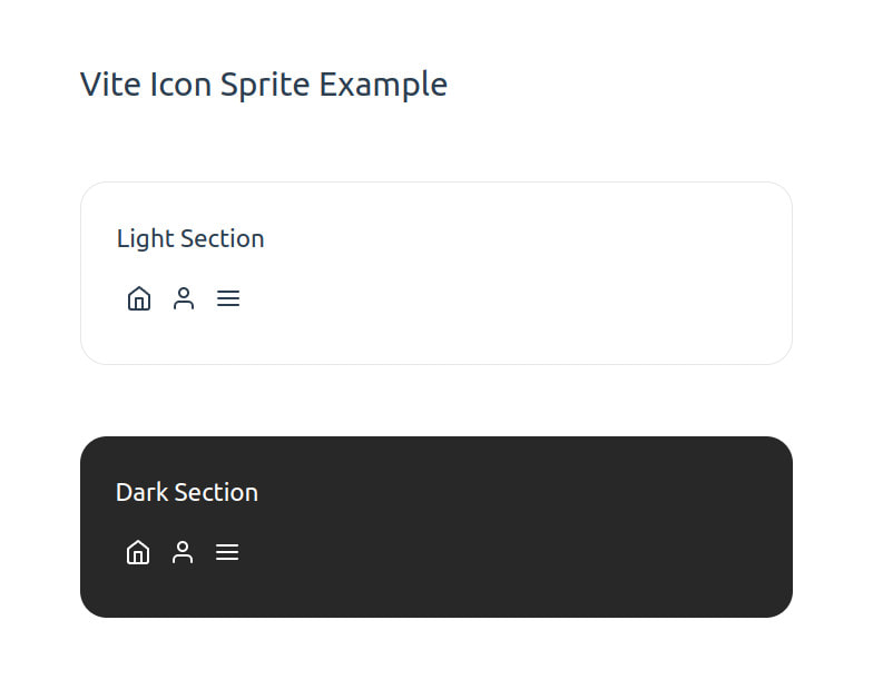
Here’s my final App.vue for this example:
<script setup>
import IconHelper from './components/IconHelper.vue';
import SvgSprite from './components/SvgSprite.vue';
</script>

<template>
  <main>
    <h1>Vite Icon Sprite Example</h1>
    <section class="light">
      <h2>Light Section</h2>
      <IconHelper icon="home" />
      <IconHelper icon="user" />
      <IconHelper icon="menu" />
    </section>
    <section class="dark">
      <h2>Dark Section</h2>
      <IconHelper icon="home" />
      <IconHelper icon="user" />
      <IconHelper icon="menu" />
    </section>
  </main>
  <SvgSprite />
</template>

<style scoped>
  section {
    margin: 4rem 0;
    padding: 2rem;
    border-radius: 1.5rem;
    width: 40rem;
  }

  h2 {
    margin-bottom: 1rem;
  }

  .light {
    border: 1px solid var(--vt-c-divider-light-2);
  }

  .dark {
    background-color: var(--vt-c-black-mute);
    color: var(--vt-c-white);
  }

  .icon {
    margin: 0.5rem;
  }
</style>
You can try it out for yourself by downloading the home, user, and menu icons from the great Feather Icons set and adding them to your /src/assets/icons/ folder.
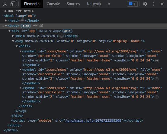
If you inspect the code of that page, you’ll see the sprite containing the icons as symbols added to the bottom of the #app element:
Closing Words
And there you have it! An automatically generated and optimised SVG icon sprite built for Vite! 🎉 I hope this can serve as a base for you to create your own icon sprites matching the requirements of your projects.
Something to Keep in Mind
The way the code in this example is built, you will run into issues when importing unrelated SVGs in other parts of the project, since they would also be optimised by the svgo Vite plugin and thus be excluded from the final build. You can use the include and exclude options of the plugin to circumvent that issue—or extend the plugin, so it knows better which SVGs go into the sprite and which don’t and thus need to be added as assets to the final bundle.
I hope this tutorial was useful to you! If you have any thoughts or comments on the matter, feel free to reach out over on Mastodon. Thank you for reading, keep on building, and I’ll be back with another post in March!