This might seem like an oddly specific topic, but it’s an issue I bumped into and subsequently grappled with a bunch of times this month. So, as a reminder to my future self and hopefully anyone else: here’s a way to ensure an image doesn’t affect a grid row without an explicit height.
The Problem
I was working on a set of modules for a website this week which consist of a classic 12-column grid, but only have one automatically sized row. Think of it as your regular text-media combo module, which I’ve simplified for this example.
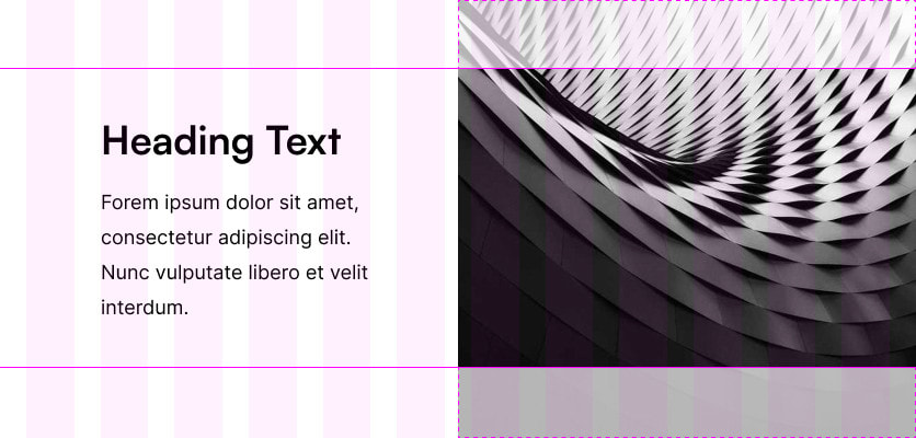
To the left, I have some text content, which is what I want to influence the height of the grid-row (hence why it doesn’t have an explicit height set). To the right, there is an image, which is supposed to fill the entire height of the grid row. Sounds innocent enough, right?
The HTML markup looks something like this:
<section>
  <div class="text-content">
    <h1>Hello World!</h1>
    <p>Lorem ipsum dolor…</p>
  </div>
  <img src="https://picsum.photos/560/560" alt="A placeholder image">
</section>
And to make it look properly, let’s sprinkle in some CSS (I’m using nesting here for simplicity):
section {
  display: grid;
  grid-template-columns: repeat(12, 1fr);
  gap: 1.5rem;

  .text-content {
    grid-column: 2 / span 4;
    padding-block: 2rem;

    > :first-child {
      margin-top: 0;
    }

    > :last-child {
      margin-bottom: 0;
    }
  }

  img {
    grid-column: 6 / -1;
    display: block;
    width: 100%;
    height: 100%;
    object-fit: cover;
  }
}
This should work, right? The image should be slightly taller (in fact, exactly 4rem taller) than the element containing the text. Or in other words, the entire section should be the height of the element containing the text and the image should fill that row from top to bottom.
Well, unfortunately, that’s not how it is. The grid row will be as tall as the image in its current aspect ratio. So if the image is a square, and it is being displayed at a width of 560px, the grid row will be 560px tall (unless the element with the text content is taller than that).
Sizing Weirdness
My initial guess was that it might have something to do with the fact that the auto value of elements in flex and grid containers is not always 0 but can also evaluate to min-content among other things. Unfortunately, setting min-height: 0 on the image did nothing.
So I experimented with setting an explicit height just to see what happens. Much to my surprise, setting the height to 50% squashed the image down to 50% of its original size, but the grid-row stayed at the same height! Setting an absolute value such as 100px for the height shrunk the row as expected—but that’s not an option for what I want to achieve.
In a way that makes sense, saying height: 100% is a relative statement, 100% of what? In fact, adding an explicit height to the grid-row makes the image conform to it. I’m not sure exactly what the height: 100% is relative to, but I’d love to know! My short research seemed to suggest it would be relative to an auto value, but that answer doesn’t explain much…
A Solution
In the meantime, I experimented and eventually took to searching the internet for a solution—which proved to be quite hard, actually! It seems odd to me that not that many people have run into this issue yet.
I managed to get it working by wrapping the image into a figure and setting the figure to position: relative and the image to position: absolute, but that seemed awfully hacky. It was this thread on Reddit that finally gave me something I liked better.
It seems simply adding contain: size to the image makes it behave exactly like I want! With that line, it finally only takes up the height of the row as set by the element containing the text content, without stretching it out further! It still seems a bit magical to me, because the contain property is one I haven’t quite managed to wrap my head around yet, but I’m glad such a simple solution exists.
It has its caveats, for example, the image may also default to a width of 0 in some cases, for example when it is nested within another element, but for this instance it’s a simple enough solution that just works.
If you have struggled with this before or have any further insights into the topic, please let me know over on Mastodon! Thank you for reading and I hope this could help you out.