Hero image for QamiHero image for Qami

goal

Create the perfect application for long-form creative writing

Qami

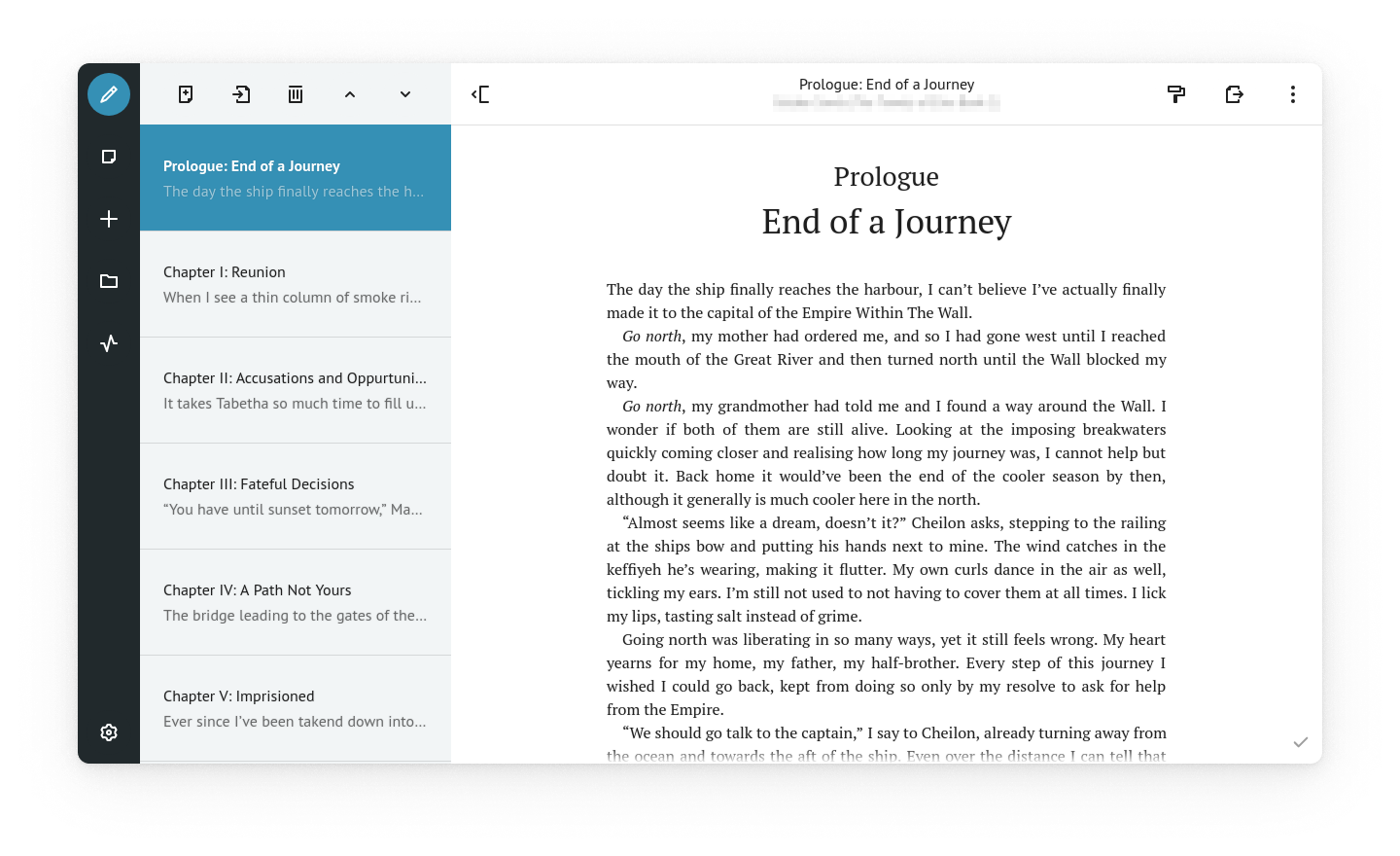
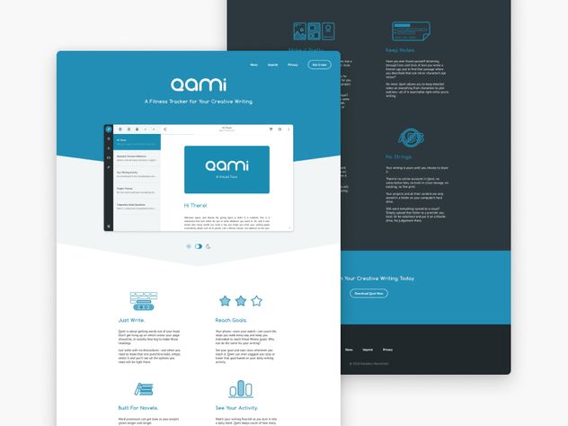
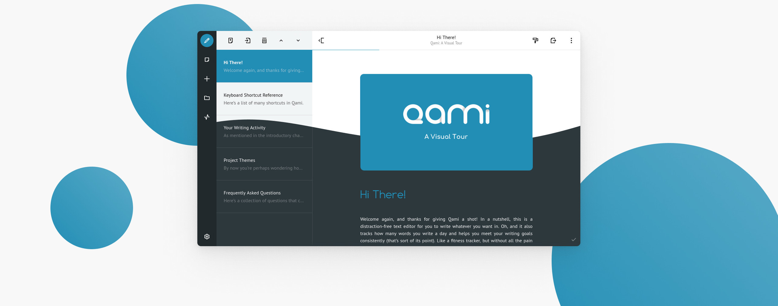
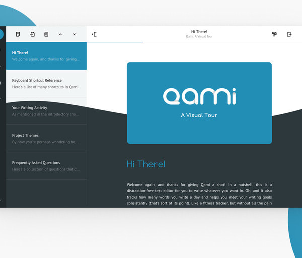
Failing to find a distraction-free word processor with the features I wanted, I set out to create my own in a yearlong process. The UI went through multiple iterations both for usability and visual experience. This is the final design from September 2018, when the first version of the application was released to the general public. Ever since, development continues, albeit at a slower pace.

Along with the creation of the application itself, I also created an extensive set of icons to fit my needs and the aesthetic of the application itself, as well as a website to present the application to the public and offer a way to download it, which matches the style of the application itself.

  • ui
  • ux
  • software
  • vuejs
  • electron
  • creative writing
Some detail shots of the Qami interface, highlighting individual components
A screeshot of Qami’s writing mode, with an open novel project showing the prologue being edited
A screenshot of Qami’s writing activity dashboard showing the activity in the month of May 2019

Qami works like a fitness tracker for creative writing. It records how many words were written on a given day and tracks whether a custom writing goal is met or surpassed. Every time a multiple of a writing goal is reached, the user is awarded a star to keep them motivated. Qami also keeps track of trends in the writing activity and suggests adjustments to the user’s writing goal based on that.

A screenshot of Qami’s library view showing a set of colourful thumbnails that look like the covers of books

While it is possible to use Qami for all sorts of things, its primary purpose is long form prose. This is why I chose to make individual writing projects look like books and gave the user the ability to set their own cover images, or fall back to the automatically generated ones.

A subset of the icons I designed for Qami
A screenshot of Qami’s writing activity dashboard showing the activity in the month of May 2019

When I made Qami available to the public in 2018, I also built a website for it that was meant to engage any interested users as well as give them a taste of the visual style of the application. That’s why I chose to quote not just the colours, but also multiple othe UI elements from the application itself, while still wrapping everything up in a neat landing page.

A selection of line-illustrations arranged in an offset pattern
Some of the illustrations I created to illustrate Qami’s features